In the initial stages of an ad’s development either the copy writer or the art director forms a mental image of the ad. The copy writer may use rough sketches to develop the theme and to convey ideas to the artist. The artist will visualize the thought sketch and provide a pictorial representation of it.
Visualisation is often confused with the terms illustration and layout. Visualisation precedes both the illustration and layout and is the process of forming a mental image, picture or representation of an object or idea. The layout is the physical arrangement of the elements in an advertisement so that this mental idea may be effectively presented. The picture portion of the layout is generally referred to as the illustration.
Much of the creativity in advertising evolves from the process of visualisation and the countless ways in which mental images can be made to represent ideas. Impending danger is vividly and graphically presented by an onrushing train over an old trestle, a child retrieving a ball in a street, or a flashing red light.
Effective advertising requires that these images be consistent with a advertiser’s message, which is concerned with the need or desire the product fulfills.
It is the job of the layout artist to combine all the elements in the idea into a single, effective communication. This requires adding to the idea a head line, illustration, body text, logotype and occasionally a sub head line, picture caption trade mark, coupons or seal of approval.
The layout is the arrangement of all the verbal copy element plus the art work (drawing, photography, logo types) on the paper. The layout shows the rough composition of the design of a print ad so that all of those concerned with the ad can evaluate it and so that those who need to produce the ad will have the blue print to follow.
Purposes and Function of Layout:
There are following reasons for making a layout:
1. The layout provides a working blending of the creative abilities of all personnel involved in the preparation of the advertisement.
2. It provides a blue print to meet the mechanical requirements of engravers, typographers, and others, as well as giving specifications for estimating costs.
3. A layout shows how an ad is to look and, therefore, must contain all the necessary elements.
4. It permits all interested parties, particularly the client, to see the advertisement before final steps are taken to put it in print.
5. The layout also serves as gauge to determine if all the materials that will go into the advertisement will fit into a given space.
Layout Procedure:
Layout procedure is a logical progression from the visualization to the completed arrangement.
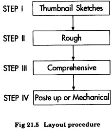
Layout procedures involves the following steps (Fig. 21.5):
Step-I:
Thumbnail sketches:
Frequently layout starts with thumbnail sketches, simple drawings that contain an ad’s basic elements. These small sketches are generally drawn in the experimental stage to show the different ways of arranging the elements. Not every designer uses a thumbnail sketch, however; some skip this step altogether and begin with the rough.
Step-II:
Rough:
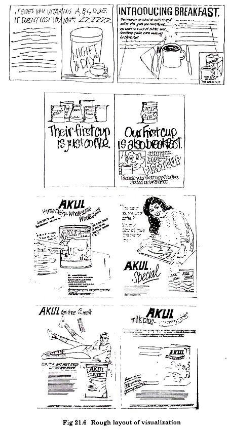
The rough, or visual, evolves from the acceptable thumbnail and although it is still some what sketchy, it begins to present more detail. The purpose of the rough is to convey the idea to agency personnel. It is the same size as the future advertisement, but the illustrations are roughed in, the head lines are lettered hastily, and the copy blocks are represented by horizontal parallel lines.
Despite the hosty sketching and lack of detail, tonal values are clearly apparent, as is the spacing of the elements. The rough is good for analysis and criticism and a number of roughs may be completed before the final one is accepted (Fig. 21.6).
Many agencies feel that roughs are fresher and have more spontaneity than the comprehensives which is the next steps. Therefore, they use roughs exclusively to show to clients. The philosophy behind this is that the client is required to judge the idea, not its execution. Roughs are also less expensive.
Step-III:
Comprehensive:
A comprehensive usually appears on heavy paper or card board and provides further refinement of the rought. The art work is shown in approximately its final form or when a photograph is used, the photograph or a carefully prepared postal representing it will be pasted into position.
Head lines are carefully traced or reproduced by other means. Typed matter is shown by ruled lines and careful lettering is shown in its exact hue and value to indicate tone and colour.
Comprehensives are expensive. They are frequently prepared by a free-lance artist or art studio and used to help the client judge the effect of the finished advertisement. Payment for the art work is subject to negotiation when an agency is hired.
Generally advertising agencies absorb the cost of finished layouts in commissions they receive from media, but the client may be billed for the additional expense of a comprehensive layout when a comprehensive is not prepared the finished layout, which is more carefully executed than the rough, may be submitted to the client for approval.
Step-IV:
Paste up or mechanical : The paste up or mechanical, is actually a step beyond layout, but is so closely allied that it is frequently considered as part of the process. To determine the size for the paste up, the designer can refer to a publication rate card or standard rate and data service which offers such information for various media.
The paste up contains all the elements of a layout. Often the type is photographed in place but, the art elements are photographed separately. Then all parts are “stripped in and made into a final film—from which plates are made.
Principles of Effective Layout:
Fundamentally a good layout should attract attention and interest and should provide some control over the manner in which the advertisement is read. The message to be communicated may be sincere, relevant and important to the consumer, but because of the competitive noise in the communication channel, the opportunity to be heard depends upon the effectiveness of the layout.
In alteration to the attracting attention, the other requisite for the effective layout includes:
(a) Space division and balance
(b) Proportion
(c) Movement
(d) Unity
(e) Emphasis
(f) Clarity and simplicity.
(a) Space Division and Balance:
While it is difficult to give an exact definition for the division of space, it is, however, this proper dividing of space that satisfies an inner sense of proportion and causes the reader to be pleased with the harmonious structure of the advertisement.
The division of space leads in to a wide variety of complicated designs or patterns. However, at present it is more important to consider the fundamental divisions and their comparative values in order that the different units (illustration, headlines, copy, trade mark, signature, and so on) may be placed and divided effectively.
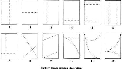
Fig. 21.7 illustrates the various space divisions. Illustration 3 is divided at the center by a vertical dotted line. Number 2 is divided into a equal parts by a horizontal line. Both spaces have been cut exactly in half, leaving two equal divisions for space, This is the least complex of any possible division.
Such divisions which are equal have a tendency to be uninteresting & monotonous. Monotony many result from equality or uniformity. Thus, to avoid monotony, it is usually better not to divide the space into equal parts.
Illustration 3 & 4 depicts inequality. It illustrate a dramatic, unequal, interesting situation. These situations are the kind that attract attention.
Illustration 5 & 6 are similar to 3 & 4 except that each one has divided into 3 spaces instead of two. These division give dramatic situation which for attracting interest are probably greater than those found in 3 & 4.
Illustration 7 gives a more complex division of space. None of the four spaces is equal in area. It broadens even further the possible fields of activity which enable a layout man to produce greater variety. It has the advantage of oblongs, both horizontal and vertical. The intersecting point of the two divisional lines also results in an “X”. This provides another device for attracting attention.
Illustration 8 provides a space divided into 4 unequal parts, three of them forming triangles of different sizes. The division is brought about by two diagonal lines crossing each other, producing the “X”. The crossing of two opposed diagonal lines is symbolic of crossed swords, and creates the atmosphere of duels, battle and the like. This dramatic attraction attracts attention and creates interests.
Illustration 9 in another of the many possible uses of diagonals. This is similar to illustration 5, but possesses an appeal with greater dynamic force than straight horizontals. Here one gets the feeling of the power required to pull something uphill and the effect of costing down at a high rate of speed.
Illustration 10 portrays a combination of straight and circular lines bringing about two curved space divisions. Curves create soft fluid designs, lacking in force and directness when compared to straight lines, but making up for this deficiency in beauty.
In illustration 11 and 12, the divisional lines are curved. It is the opinion of many artists that straight lines are masculine in feeling and curved lines are feminine. Men usually are attracted by advertisements that go straights to the facts in a logical manner. Beauty in advertising is not as important to man as it to women.
Women are usually attracted by advertisements that tend toward the artistic and consider logic and facts as secondary. It should not be overlooked, however, that curved divisions of space made by straight lines create a feeling of power, speed and excitement.
(b) Proportion:
Proportion helps develop order and creates a pleasing impression. It is related to balance but is concerned primarily with the division of space and the emphasis is to be accorded each element. Proportion, to the advertising designer, is the relationship between the size of one element in the ad to another, the amount of space between elements, as well as the width of the total ad to its depth.
Proportion also involves the tone of the ad, the amount of light area in relation to dark area and the amount of colour and non colour.
As a general rule unequal dimensions and distances make the most lively design in advertising. The designer also places the elements on the page so that each element is given space and position in proportion to its importance in the total advertisement and does not look like it stands alone.
(c) Movement:
If an advertisement is to appear dynamic rather than static, it must contain some movement. Movement (also called sequence) provides the directional flow for the advertisement, gives it its follow through, and provides coherence. It guides the reader’s eye from one element to another and makes sure he does not miss any things.
Motion in layout is generally from left to right and from top to bottom—the direction established through the reading habits of speakers of western language. The directional impetus should not disturb the natural visual flow but should favour the elements to be stressed, while care should be taken not to direct the reader’s eye out of the advertisement.
(d) Unity:
Another important design principle is the unification of the layout. Although an advertisement is made up of many elements, all of these should be welded into a compact composition. Unity is achieved when the elements tie into one another by using the same basic shapes, sizes, textures, colours and mood. In addition, the type should home the same character as the art.
A border surrounding an ad provides a method of achieving unity. Sets of borders may occur within an ad, and, when they are similar in thickness and tone, they provide a sense of unity.
Effective use of white space can help to establish unity, white space is defined as that part of advertising space which is not occupied by any other elements; in this definition. White space is not always white in colour.
White space may be used to feature an important element by setting it off, or to imply luxury and prestige by preventing a crowded appearance. It may be used to direct and control the reader’s attention by tying elements together. If white space is used incorrectly, it may cause separation of the elements and create difficulty in viewing the advertisement as a whole.
(e) Emphasis:
Although varying degrees of emphasis may be given to different elements, one unit should dominate. It is the designer’s responsibility to determine how much emphasis is necessary, as well as how it is to be achieved. The important element may be placed in the optical center or removed from the clutter of other elements. Emphasis may also be achieved by contrasts in size, shape and colour, or the use of white space.
(f) Clarity and Simplicity:
The good art director does not permit a layout to become too complicated or tricky. An advertisement should retain its clarity and be easy to read and easy to understand. The reader tend to see the total image of advertisement; thus it should not appear fussy, contrived or confusing.
Colour contrasts, including tones of grey, should be strong enough to be easily interpreted, and the various units should be clear and easy to understand. Type size and design should be selected for ease of reading, and lines of type should be a comfortable reading length.
Too many units in an advertisement are distracting; therefore, any elements that can be eliminated without destroying the message should be one way in which clarity can be achieved is by combining the logo, trade mark, tag line, and company name into one compact group.


