After reading this article you will learn about:- 1. Functions (Scope) of Breakeven Chart 2. Construction of Breakeven Chart 3. Interpretations and Analysis 4. Procedure to Draw 5. Limitations.
Functions (Scope) of Breakeven Chart:
1. A breakeven chart is an aid to management and it depicts a clearer view of the position of a business.
2. It is one of the most useful graphic presentation of accounting data.
3. It is a graphic presentation of an economic rather than an accounting concept.
4. It portrays likely profits or losses at various output levels.
5. It depicts relationship between marginal costs and fixed costs.
6. It marks no profit no loss situation.
7. It portrays margin of safety.
8. It can help make specific plans to effect profits through the control of expenses.
9. It can nicely sum up the impact of alternative decisions on costs and profits.
10. It is a decision making tool in the hands of management.
Construction of Breakeven Chart:
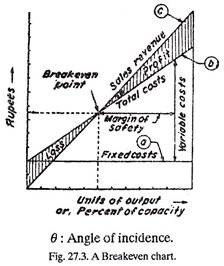
Fig. 27.3 portrays a breakeven chart.
The breakeven chart consists of an ordinate (y-axis) and an abscissa (x-axis). The ordinate presents a scale of rupees against which fixed costs, variable costs, and rupees of revenue can be measured. The abscissa can be dimensioned in terms of the production volume, i.e., number of units produced. Three lines marked as a, b and c can be noticed on the breakeven chart. Line ‘a’ is a fixed cost function.
Fixed charges do not change as a function of increased volume of production. Line ‘b’ is an increasing linear, monotonic function that increases with increasing volume of production. It represents total costs which result from the summation of fixed and variable costs. The variable costs assigned to the production system are shown by the triangular area between the fixed cost line and total costs line, i.e., ‘a’ and line ‘b’.
Line ‘c’ is the sales revenue line. A linear relationship is utilized to describe revenue; which indicates that the price at which any quantity of the output can be sold is fixed and does not change with volume of production. This line indicates income at varying levels of output or production volume.
Interpretations and Analysis of a Breakeven Chart:
1. The breakeven point marking no profit no loss situation occurs for a given volume of production.
2. The cross-hatched area between the total cost line and revenue line on the left-hand side of the breakeven point marks loss to the concern whereas the area between the same lines on the right-hand side of the breakeven point represents profit to the enterprise or concern.
3. Profit appears only when more than a minimum volume of output is reached. Profit increases at a faster rate than do total costs.
4. Profit margin as %
= 1 – Variable cost/Sales
Where, sales = Fixed costs + (Variable costs as a % sales) sales.
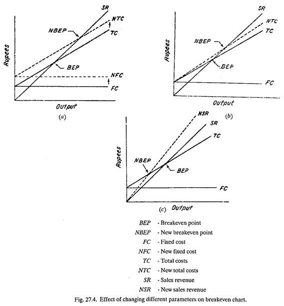
5. Effect of an increase in fixed costs [Fig. 21. 4 (a)]. An increase in fixed costs, possibly owing to the purchase of a new machine, increases the total costs and thus shifts BEP (Breakeven Point) towards the right-hand side. This shows that the company’s profit position will be impaired if all other conditions remain the same. Therefore, one should study the market conditions carefully before purchasing the new equipment.
6. Effect of an increase in variable cost [Fig. 21A (b)].
An increase in variable cost and therefore in total costs, possibly owing to an increase in labour cost, would shift the BEP towards the right-hand side. This involves a decrease in profit for the same units of output. Therefore the management may think of going for some new labour saving equipment to maintain its profits as before.
7. Effect of an increase in sales price [Fig. 27.4 (c)]. If the price of an article rises, a new sales revenue will be drawn with a greater slope. This shifts the BEP towards the left-hand side and thus increases the company profits for the same volume of output.
8. Effects of a decrease, in fixed cost, variable cost and sales price can be visualised in the same manner as above by drawing separate breakeven charts as in Fig. 27.4.
Margin of safety:
(i) Margin of safety can be presented on the breakeven chart as the distance between BEP and the output being produced (Fig. 27.3).
(ii) If this distance is large, it indicates that profits will be there even if there is a serious drop in production.
(iii) If this distance is relatively small, it hints that profits will be reduced considerably even if there is a small drop in productive capacity or sales.
(iv) Margin of safety may be expressed in monetary terms or as a percentage — the margin of safety in relation to total sales.
Angle of incidence:
(i) This is the angle (θ) at which sales revenue line cuts the total costs line (refer Fig. 27.3).
(ii) A large angle indicates that profits are being made at a high rate.
(iii) A large angle of incidence with a high margin of safety, mark the extremely favourable business position.
Procedure to Draw Breakeven Chart:
1. Draw the fixed cost line (AB) at Rs. 80,000 on the graph paper.
2. Variable cost = No. of units x Variable cost per unit
= 10,000 x 4 = Rs. 40,000.
Variable cost varies from 0 at 0 units to Rs. 40,000 at 10,000 units.
3. Draw variable cost line (AC) above the fixed cost line. The variable cost when added to fixed cost gives the total cost.
4. Sales revenue is zero at 0 units and it is 200,000 at 10,000 units. Therefore draw the sales revenue line OD.
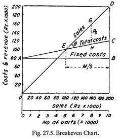
Breakeven chart has been drawn in Fig. 27.5.
(i) In the breakeven chart, point E represents the breakeven point. It is at 5,000 units or Rs. 100,000, i.e., where production when sold will return Rs. 100,000 in revenue to the company.
(ii) The company should produce and sell more than 5,000 units to seek profit.
(iii) The profit earned at a turnover of Rs. 160,000 is marked by Ps in Fig. 27.5 and it is equal to Rs. 48,000.
(iv) The margin of safety at 10,000 units has been marked by M/S in Fig. 27.5 and it is
= Total sales-Sales figure at B.E.P.
= Rs. 200,000-100,000=Rs. 100,000
Also, margin of safety when represented as a percentage is
= Margin of safety/Total sales x 100
= 100,000/200,000 x 100 = 50%
(v) The angle of incidence 6 has been marked in Fig. 27.5 and is 34.3°.
Limitations of Breakeven Chart:
1. The breakeven point is difficult to determine in many instances because of the difficulty in properly classifying costs as either fixed or variable and because market conditions may not remain constant over the range of projected capacity.
2. The breakeven chart is a tool for short run analysis; it cannot be used for 8 or 10 year projections because of the difficulty of indicating variables in each of the costs line on the chart.
3. The total cost line, representing the variable costs added to fixed costs, need not be straight line, in actual fact, costs do not usually vary in direct proportion.
4. The straight line which represents sales revenue may also misrepresent the true facts.
5. The breakeven chart represents a static picture whereas business operations are far from static.
6. Analysis of breakeven chart presents additional difficulties, (e.g., in product mix) when a company produces a variety of products.
Example:
The fixed costs for the year 1975-76 are Rs. 80,000. The estimated sales for the period are valued at Rs. 200,000. The variable cost per unit for the single product made is Rs. 4. If each unit sells at Rs. 20, and the number of units involved coincides with the expected volume of output, construct the Breakeven Chart.
(i) Determine the breakeven point.
(ii) Above how many units, the company should produce in order to seek profit.
(iii) Determine the profit earned at a turnover of Rs. 160,000.
(iv) Find the margin of safety.
(v) Measure the angle of incidence.
Solution:
Given: F = Rs. 80,000 (fixed cost)
V = Rs. 4 (variable cost per unit).
P = Rs. 20 (selling price of each unit).
Estimated sales, S = Rs. 200,000.
. . . No. of units sold = 20,000 (S)/20(P) = 10,000.


